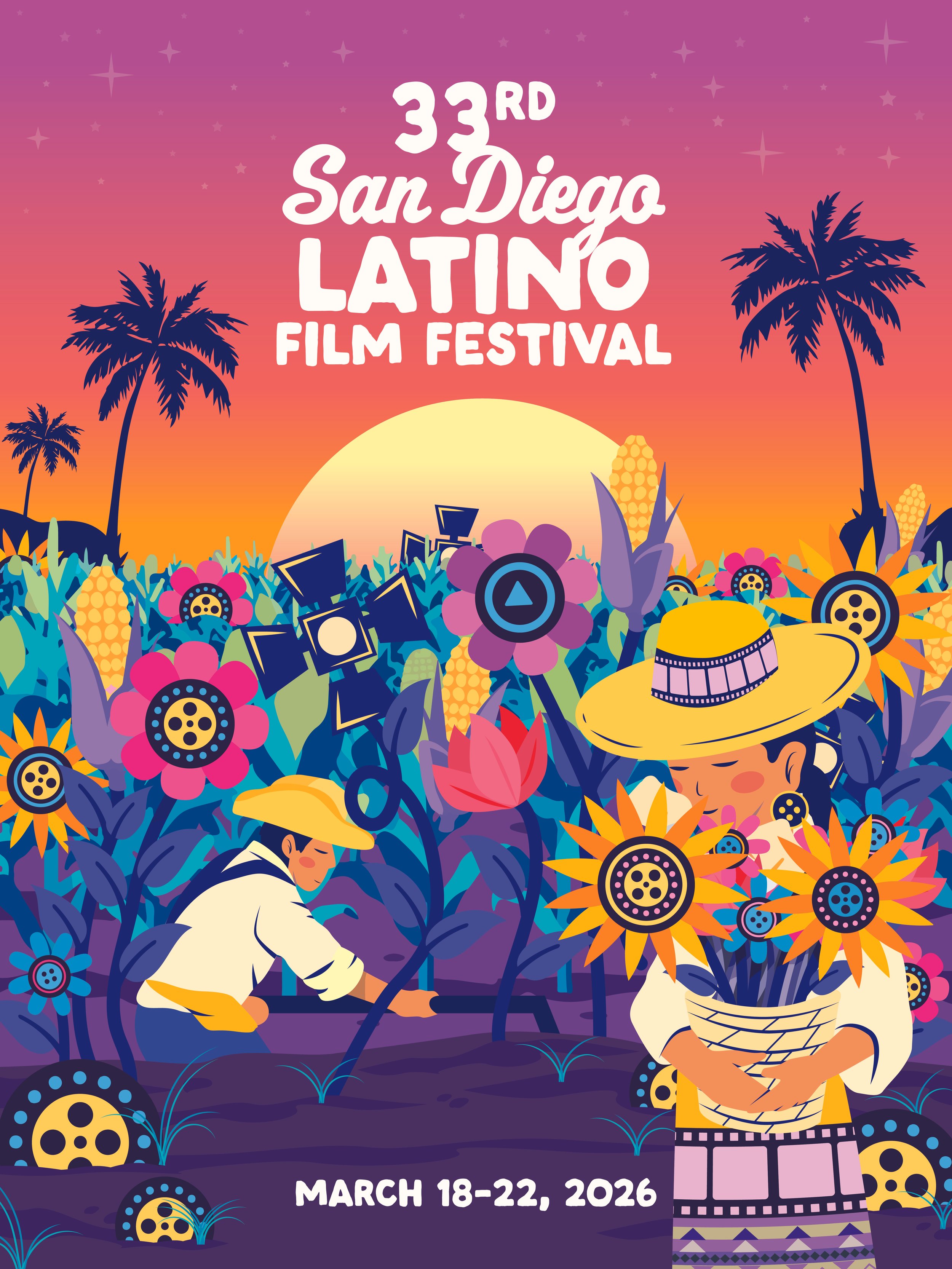
Overview
This project was a selected finalist entry for the 33rd San Diego Latino Film Festival poster competition. The goal was to create a visual identity for the 2026 festival that celebrates the intersection of Latino culture, history, and the art of filmmaking.
Tools
Adobe Illustrator
Design Goal
I developed a concept titled "Cultivating Stories," using a vibrant, contemporary folk-art style. The illustration depicts a "milpa" (cornfield) where the tools of cinema are literally part of the harvest.
Key Design Features:
Cinematic Symbolism: Look closely and you’ll find "Easter eggs" throughout the field, such as film reels serving as the centers of blooming sunflowers and studio barn-door lights growing alongside the corn.
Cultural Fabric: The figures wear clothing adorned with film strip patterns, subtly suggesting that our stories are woven into our daily lives and heritage.
Setting the Scene: The backdrop features a classic San Diego/Baja sunset with palm trees, grounded in a palette of electric purples, oranges, and teals to capture the energy of the festival.
Integrated Typography: The festival title and dates (March 18–22, 2026) are positioned prominently, framed by a star-studded sky that adds a touch of "Hollywood" magic to the rural scene.
Outcome
The design was recognized as a finalist entry, praised for its unique narrative approach and bold use of color. It successfully communicated the 2026 festival’s theme of growth and storytelling, bridging the gap between the people who work the land and the people who tell their stories on the silver screen.
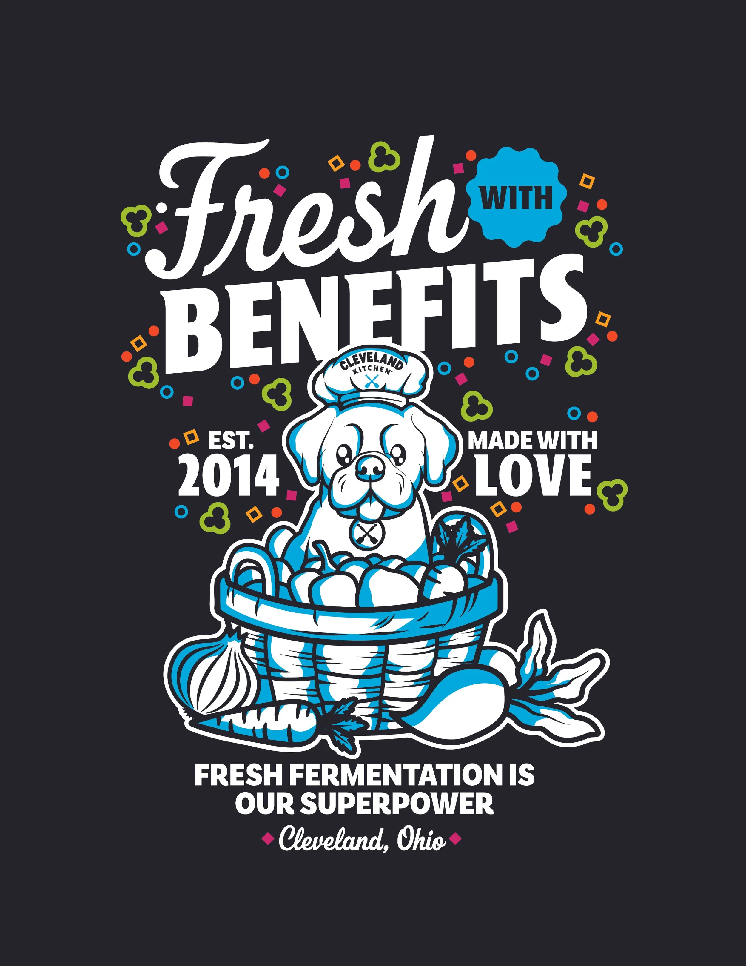
Overview
This project was created as a submission for the merchandise design contest hosted by Cleveland Kitchen. The goal of the contest was to develop original merchandise graphics that reflect the brand’s personality, mission, and focus on fresh fermentation.
Tools
Adobe Illustrator
Adobe Photoshop
Design Goal
The objective of this design was to visually communicate Cleveland Kitchen’s core brand message: “Fresh Fermentation Is Our Superpower.” The design needed to be bold, fun, and easily adaptable for merchandise such as apparel while maintaining strong readability and visual impact.
Design Concept
The concept centers around the idea that fermentation is not just a process but the brand’s defining strength. By highlighting the phrase “Fresh Fermentation Is Our Superpower”, the design reinforces Cleveland Kitchen’s commitment to fresh ingredients, natural fermentation, and bold flavor.
Graphic elements and typography were chosen to create a lively and energetic composition that reflects the brand’s modern food culture and its roots in Cleveland, Ohio.
Process
The design process began with researching the Cleveland Kitchen brand identity, including its tone, messaging, and existing visual language. Sketches and digital drafts were developed to explore different typographic arrangements and graphic elements that could translate effectively onto merchandise.
The final design was refined to ensure clarity, scalability, and print-ready quality for apparel production.
Outcome
The final submission presents a bold, merchandise-ready graphic that captures Cleveland Kitchen’s personality while reinforcing its key message about fermentation. The design was created to work across multiple merchandise formats, making it adaptable for T-shirts, hats, and promotional products.
Overview
A publication design documenting experiences from the Marywood University MFA study tour.
Tools
Adobe Illustrator, Adobe InDesign, Adobe Photoshop, Procreate
Design Goal
To create a structured editorial layout that combines photography, narrative, and typography.
Outcome
The final book design emphasizes visual storytelling and organized content flow.
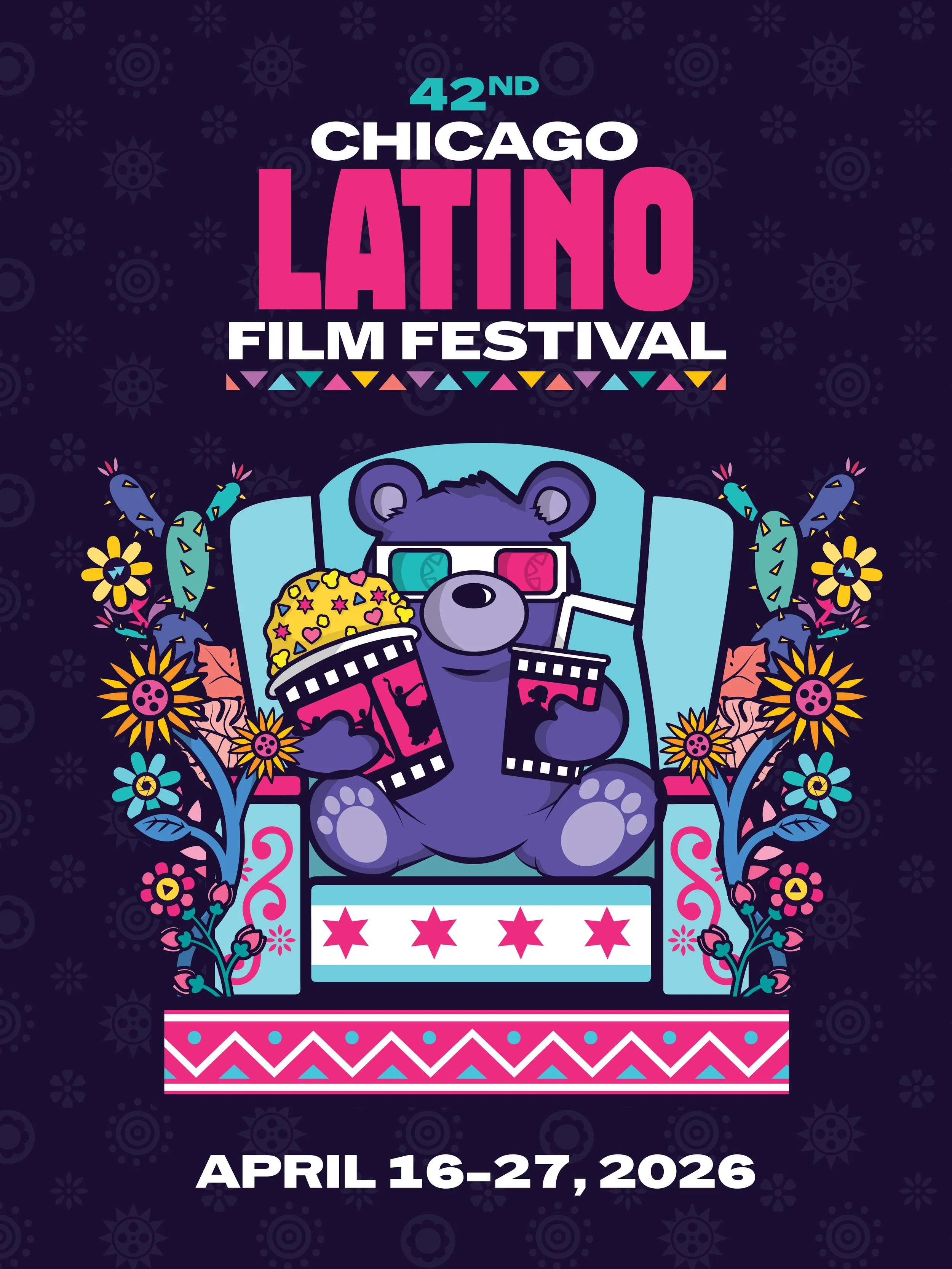
Overview
This project was a poster design entry for the 42nd Chicago Latino Film Festival, taking place April 16–27, 2026. The objective was to create a celebratory and approachable visual identity for one of the largest and most prestigious Latino film festivals in the United States.
Tools
Adobe Illustrator
The Challenge
The challenge was to capture the "vibe" of Chicago while simultaneously celebrating the diversity of Latino cinema. I wanted to avoid purely architectural references to the city and instead find a way to represent the joy, community, and excitement of the theater-going experience.
The Solution
I designed a character-focused poster featuring a whimsical bear mascot—a subtle nod to Chicago’s iconic sports and city identity—fully immersed in the cinematic experience.
Key Design Features:
Chicago Pride: The theater seat prominently features the four red six-pointed stars from the Chicago city flag, grounding the design in its host city.
Cinematic Joy: The bear is shown wearing 3D glasses and holding oversized snacks, with the popcorn and soda containers featuring silhouettes of people in motion, symbolizing the energy found in film.
Floral Framing: The central character is framed by vibrant cacti and marigold-inspired flowers, blending traditional Latino botanical symbols with a modern, clean illustration style.
Bold Typography: I used a heavy, stacked sans-serif typeface for "LATINO," giving it a modern, "blockbuster" feel that commands attention against the dark, patterned background.
The Impact
By using a central character and a bright, "neon-adjacent" color palette, the poster appeals to a wide demographic, making the festival feel inclusive and fun. It demonstrates an ability to take a established city brand (Chicago) and remix it with specific cultural and industry-related elements to create a fresh, collectible-style design.
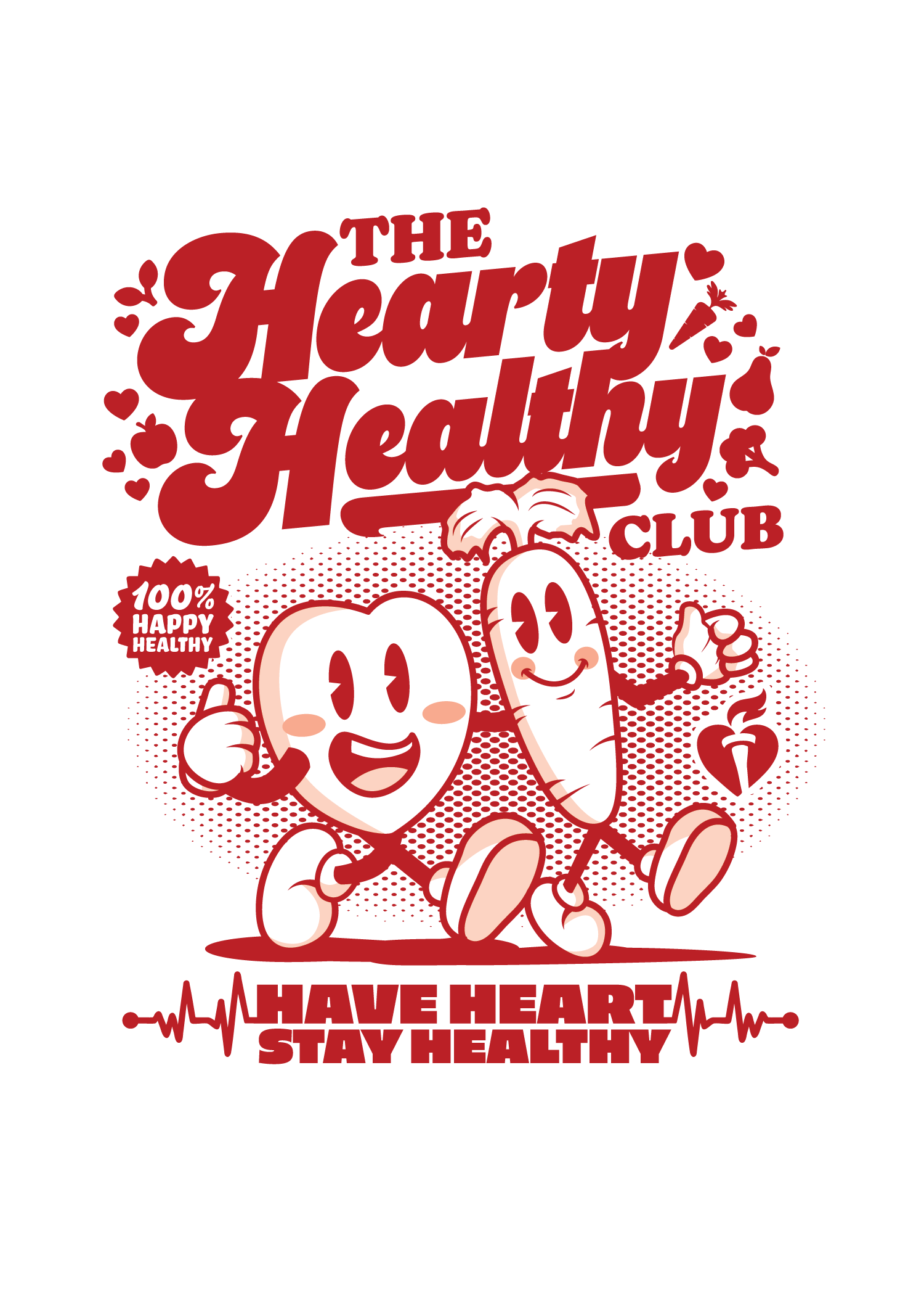
Overview
This project was created as a submission for the T-shirt design contest hosted by the American Heart Association. The goal of the contest was to develop a fun and engaging shirt design that promotes heart health awareness while encouraging positive lifestyle habits. The design received 1st Place in the competition.
Tools
Adobe Illustrator
Adobe Photoshop
Design Goal
The objective of this design was to communicate an uplifting message about heart health in a playful and approachable way. The design needed to appeal to a wide audience while reinforcing the importance of maintaining a healthy lifestyle through visual storytelling.
Design Concept
The concept behind “The Hearty Healthy Club” uses friendly, character-driven illustrations to represent healthy living. The main characters—a smiling heart and a carrot—symbolize the connection between heart health and nutrition.
These characters are designed with energetic expressions and movement to suggest activity, positivity, and vitality. Supporting elements such as fruits, vegetables, and heart icons reinforce the theme of wellness and healthy choices.
Typography plays a major role in the composition, with bold, retro-inspired lettering that creates a sense of energy and fun while maintaining strong readability on apparel.
Visual Elements
Playful illustrated characters representing healthy habits
Bold typography to emphasize the message
Food icons that reinforce nutrition and wellness
A heartbeat graphic supporting the slogan “Have Heart, Stay Healthy”
Process
The design process began with sketching character concepts that could communicate heart health in a lighthearted and approachable way. After developing several character variations, the final illustrations were digitized and refined in Adobe Illustrator.
Typography and graphic elements were then arranged to create a balanced composition suitable for apparel printing while maintaining clarity and visual impact.
Outcome
The final design successfully communicates the message of heart health through engaging characters and bold graphic elements. Its playful tone and clear message helped the design stand out in the competition, earning 1st place in the American Heart Association shirt contest.
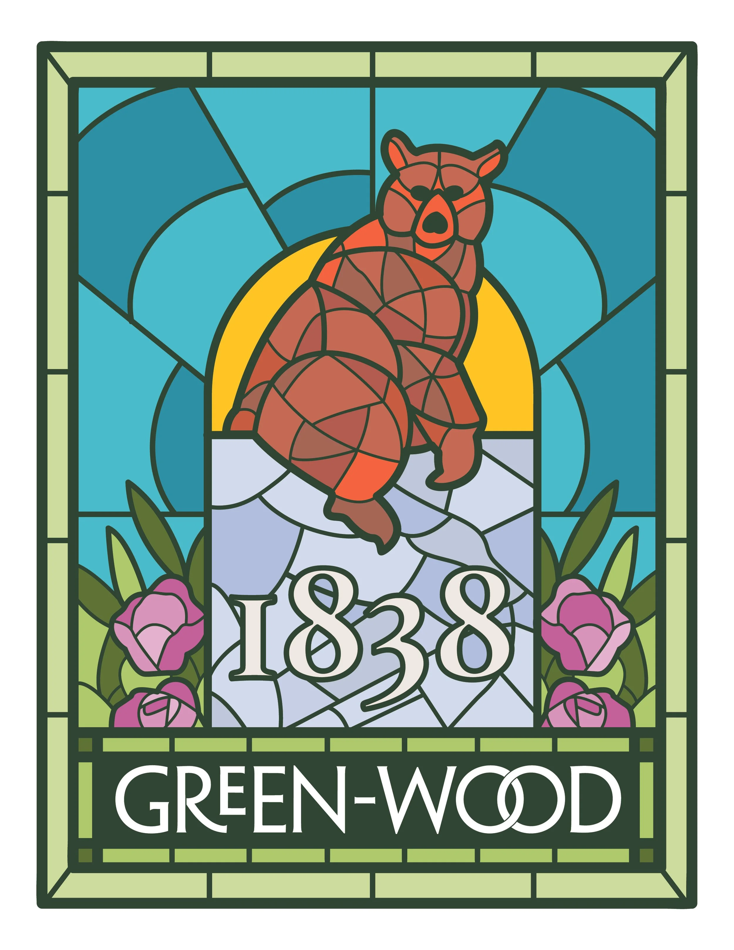
Overview
This project was a submission for a merchandise design competition for Green-Wood Cemetery in Brooklyn, NY. The goal was to create a cohesive set of collectible badges that celebrate the cemetery’s dual identity as both a National Historic Landmark and a vibrant center for urban nature.
Tools
Adobe Illustrator
The Challenge
Green-Wood is more than just a cemetery; it is an arboretum and a sanctuary for wildlife. The challenge was to move away from "spooky" clichés and instead highlight the specific, beloved icons that locals and visitors associate with the park. I needed to create a visual style that felt both historic and contemporary.
The Solution
I developed a series of three badges using a digital stained-glass illustration style. This technique pays homage to the Victorian-era craftsmanship found throughout the grounds while allowing for vibrant, modern colors.
The collection features three specific local legends:
The Bear Tomb: Inspired by the famous monument for artist William Holbrook Beard, representing the cemetery's rich sculptural history.
The Monk Parakeets: Celebrating the famous colony of wild green parrots that have lived in the cemetery's entrance spires for decades.
The Fungi: Highlighting the cemetery's role as a site for scientific study and its incredible biodiversity.
The Results
The final designs include the cemetery’s founding year, 1838, and a custom-wrapped border to create a "souvenir" feel. The result is a set of versatile assets suitable for enamel pins, patches, or stickers that appeal to history buffs and nature lovers alike.
Overview
This project explores the history and cultural contributions of the Black community in Scranton through visual storytelling and graphic design
Tools
Adobe Illustrator, Adobe InDesign, Adobe Photoshop
Design Goal
Create a logo that has visual narrative that communicates historical information while remaining visually engaging and accessible.
Outcome
The final design combines Soul Train inspired hand lettering and structured layout to present historical content in a compelling and informative format.
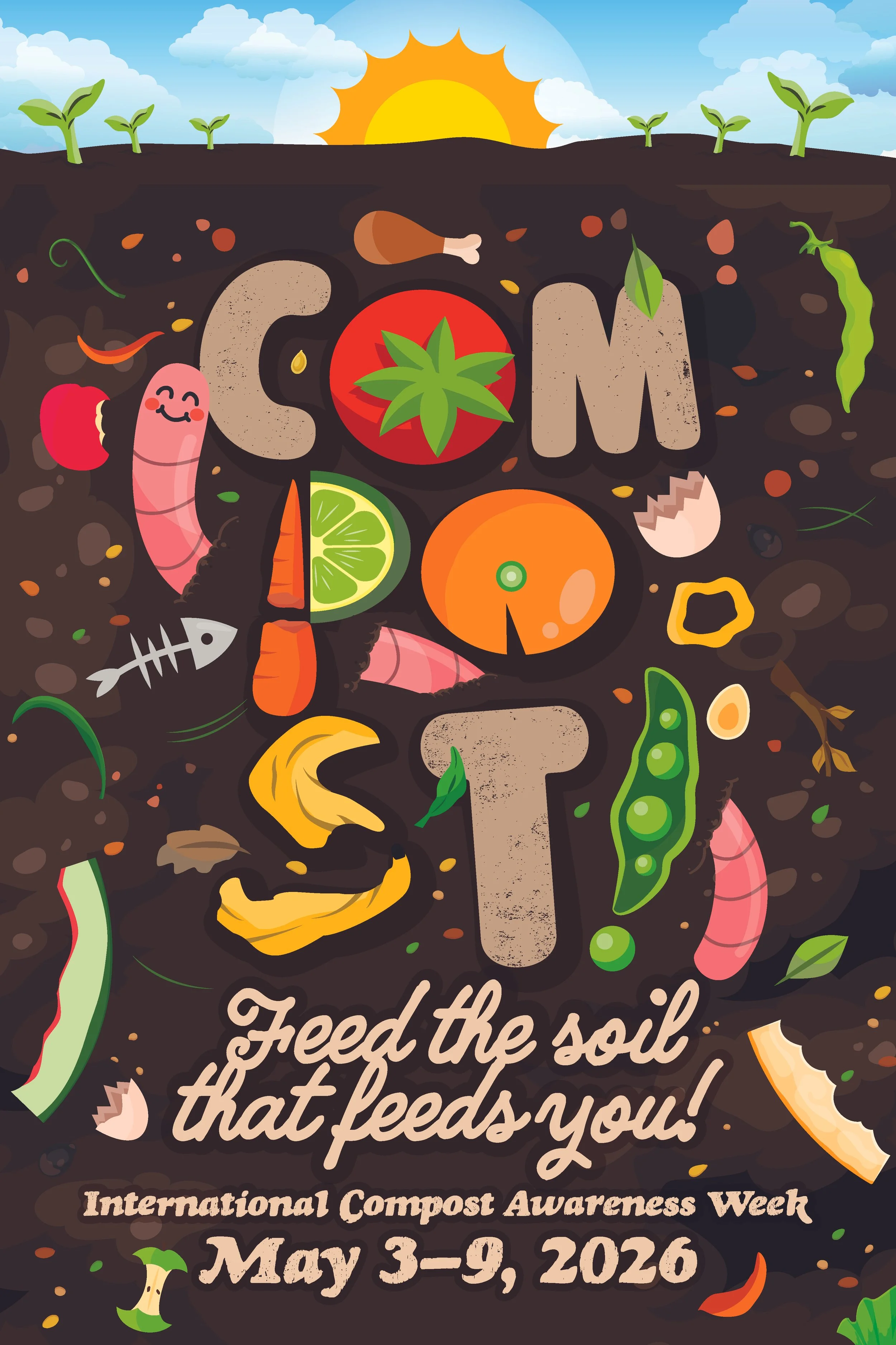
Overview
This project was a poster design entry for International Compost Awareness Week, scheduled for May 3–9, 2026. The goal was to create a compelling visual narrative that encourages sustainable waste management and highlights the benefits of composting for our environment.
The Challenge
The primary challenge was to communicate the cycle of composting—from waste to growth—in a single, eye-catching image. I wanted to move away from purely technical diagrams and instead create something that felt organic and approachable, making the concept of "feeding the soil" feel like a positive, necessary action.
The Solution
I designed a concept centered around the slogan "Feed the soil that feeds you!". The poster uses a vertical "cross-section" layout that shows the relationship between the earth and the food we grow.
Key Design Features:
Illustrative Typography: The word "COMPOST" is the focal point, with each letter custom-illustrated using common compostable items like tomatoes, limes, oranges, bananas, and peas.
The Soil Ecosystem: Beneath the surface, the design showcases a rich, dark soil filled with worms, eggshells, and organic matter, emphasizing that decomposition is a lively and essential process.
The Growth Cycle: At the top of the poster, bright sunlight and fresh sprouts symbolize the "payoff" of healthy soil, creating a visual loop that connects back to the food scraps below.
Warm, Earthy Palette: I chose a mix of deep browns for the earth contrasted with high-saturation colors for the produce to make the poster pop while maintaining a natural feel.
The Impact
By personifying elements (like the smiling worms) and using recognizable food scraps, the poster serves as an educational tool that simplifies a complex environmental process. It effectively targets a broad audience, from school children to home gardeners, making the idea of composting feel accessible and rewarding.
Overview
A branding exploration that connects the globally recognized Pepsi identity with the local community of Pittston.
Tools
Adobe Illustrator
Design Goal
To create a localized visual design that maintains brand consistency while incorporating community identity.
Outcome
The final concept balances familiar brand elements with local references to create a recognizable yet unique promotional piece.
Overview
A communication design project focused on branding and outreach materials for a church community.
Tools
Adobe Illustrator, Adobe Photoshop, Procreate
Design Goal
To develop visually clear and welcoming graphics that support community engagement and communication.
Outcome
The final designs use approachable typography and clean layouts to effectively communicate the church’s message.
Overview
A branding concept developed for a pet-focused business.
Tools
Adobe Illustrator
Design Goal
To create a friendly and memorable identity that reflects the playful nature of pets.
Outcome
The design combines approachable typography and illustrative elements to create a welcoming brand identity.
Overview
A promotional design created for the annual Pittston Tomato Festival 5K race event.
Tools
Adobe Illustrator
Design Goal
To capture the energy and community spirit of the event through bold color and dynamic typography.
Outcome
The final design highlights the festival’s lively atmosphere while providing clear event information for participants.
Overview
A visual identity concept for a campus market environment connected to Pennsylvania State University
Tools
Adobe Illustrator
Design Goal
To create clear, recognizable branding that works effectively in a retail and campus environment.
Outcome
The final design integrates bold typography and strong visual hierarchy to reinforce brand visibility.
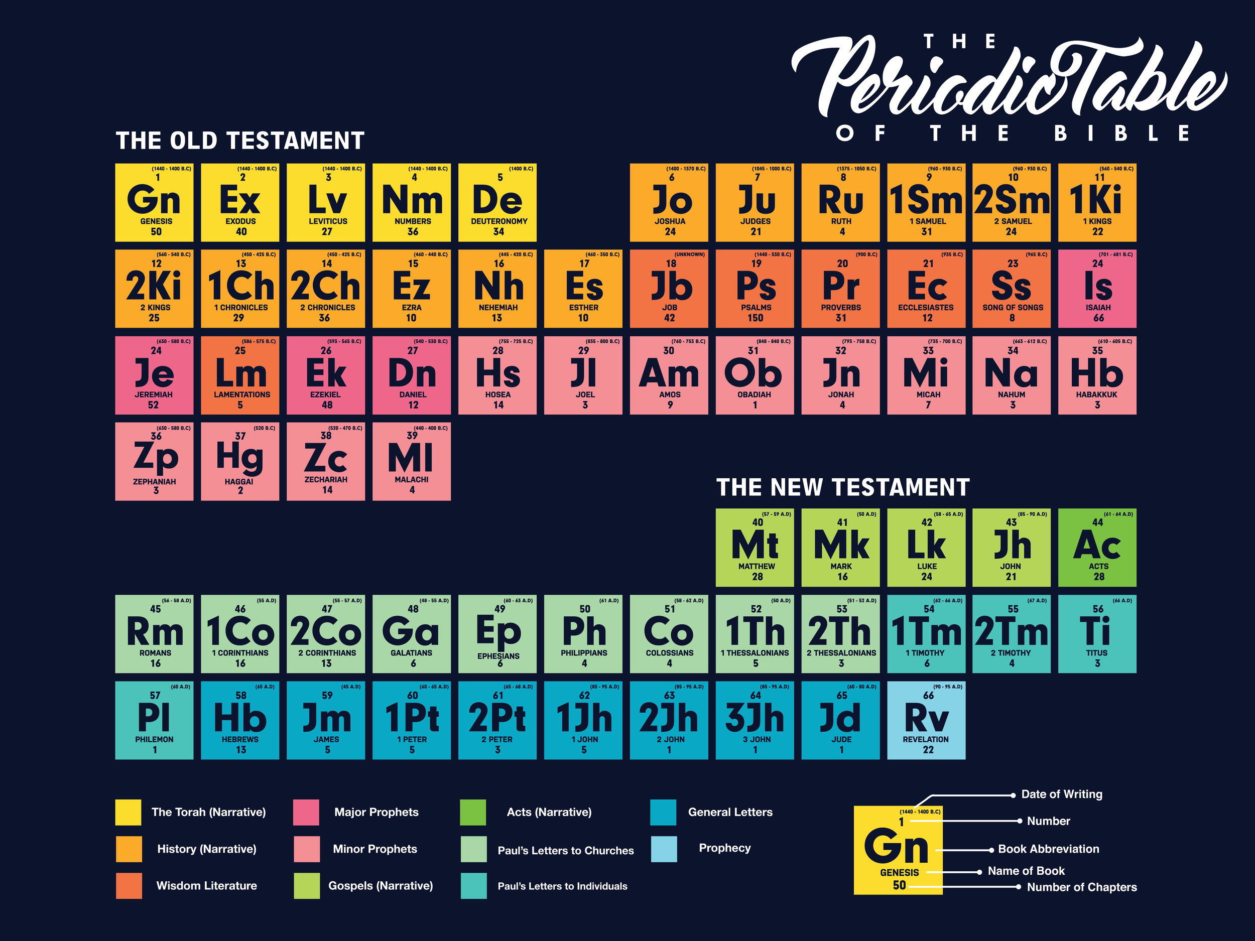
Overview
A series of infographic posters designed to communicate biblical themes through visual storytelling.
Tools
Adobe Illustrator
Design Goal
To translate complex ideas into clear visual information using icons, typography, and diagrams.
Outcome
The poster series presents educational content in an engaging and visually structured format.
Overview
A badge design system developed for Center City Print.
Tools
Adobe Illustrator
Design Goal
To create a clear identification system that supports each store and branding.
Outcome
The final badge designs emphasize hierarchy, readability, and cohesive branding.
Overview
A collection of custom lettering and typographic explorations.
Tools
Adobe Illustrator
Design Goal
To experiment with form, rhythm, and expressive letterforms.
Outcome
The project demonstrates typographic craftsmanship and creative exploration of type design.
Overview
A series of large-format banner designs created for church events and messaging.
Tools
Adobe Illustrator
Design Goal
To communicate messages clearly while maintaining strong visual presence in large formats.
Outcome
The banners combine bold typography and visual hierarchy to ensure readability from a distance.
Overview
A branding concept inspired by the historic atmosphere of Hilton Hotels & Resorts P.J.'s 1910 Pub.
Tools
Adobe Illustrator
Design Goal
To combine vintage design aesthetics with modern branding techniques.
Outcome
The final concept reflects the pub’s heritage through classic typography and timeless design elements.
Overview
A graphic design entry created for the UNIQLO Pokémon T-shirt design competition.
Tools
Adobe Illustrator
Design Goal
To create a playful and visually striking design that appeals to fans of Pokémon.
Outcome
The final artwork blends character illustration with bold graphic composition suitable for apparel printing.
Overview
A branding project developed for a casual dining establishment.
Tools
Adobe Illustrator
Design Goal
To create a strong and memorable identity that reflects a relaxed dining atmosphere.
Outcome
The final design uses bold typography and modern graphics to create a recognizable brand presence.
Overview
A poster series exploring creative typographic composition using individual letters.
Tools
Adobe Illustrator
Design Goal
To experiment with form, structure, and expressive typography.
Outcome
The series demonstrates the visual potential of letterforms as both functional and artistic design elements.
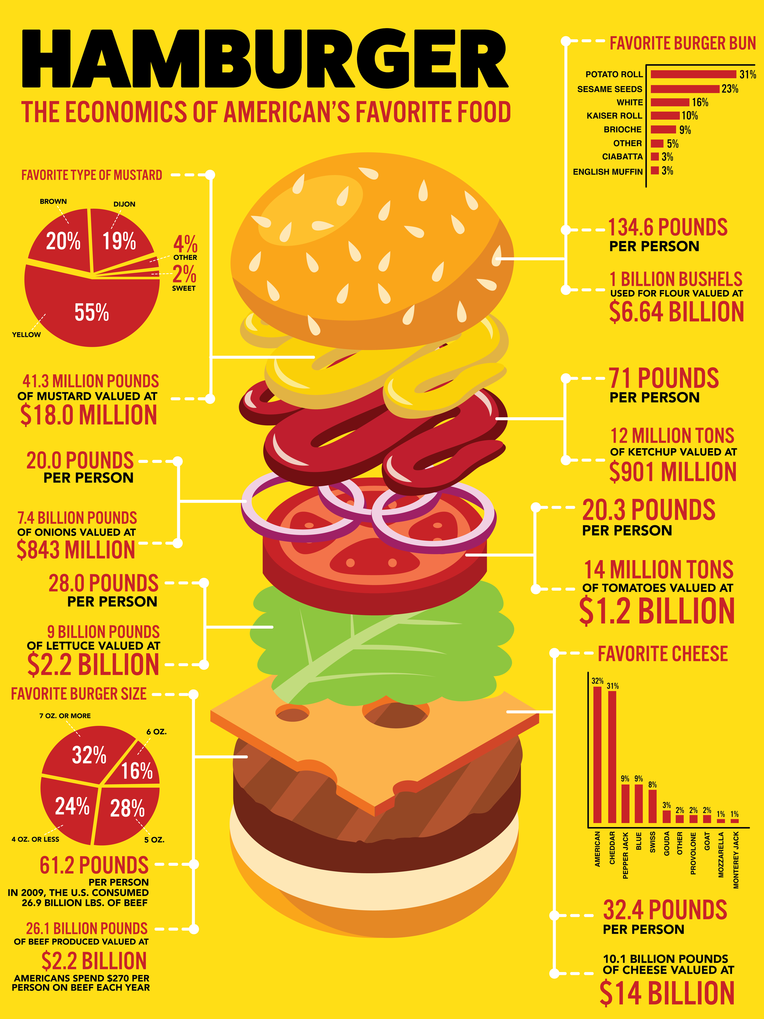
Overview
A playful infographic illustrating the components of a classic burger.
Tools
Adobe Illustrator
Design Goal
To transform everyday subject matter into engaging visual information.
Outcome
The design uses labeling, icons, and hierarchy to communicate information clearly and creatively.
Overview
A restaurant branding concept designed to highlight personality and creativity in food culture.
Tools
Adobe Illustrator
Design Goal
To develop a distinctive visual identity using bold typography and expressive graphics.
Outcome
The final design establishes a memorable and unique restaurant brand aesthetic.
Overview
A conceptual poster exploring the theme of creativity and the design process.
Tools
Adobe Illustrator
Design Goal
To visually represent abstract ideas such as imagination and innovation.
Outcome
The poster uses dynamic composition and typography to communicate the concept of creative thinking.